
THE PUBLIKA GALLERY

A unique typeface was specially designed for Publika. Its folded forms create a three-dimensional effect, but done so in an illogical manner—the forms do not follow a rational folding system.
The eccentricity of this typeface is deliberate because it is meant to capture Publika’s character as a place that is full of surprises and new discoveries, as well as its community’s fun, playful, and edgy personality.

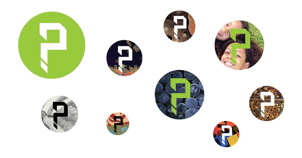
A question mark symbol was created as a teaser for Publika's launch. Art is widely regarded as a vehicle for evoking reflection and contemplation, and Publika is a place that embodies this. It is a place where ideas can roam free, where both creativity and critical thinking find a home.
Publika's question mark symbol serves as a reminder to not only keep your mind open to new ideas, but to also evaluate them critically.
Publika
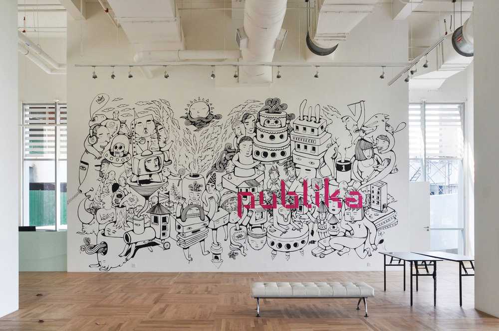
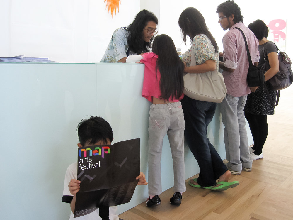
Publika Shopping Gallery is a retail mall-cum-creative hub, anchored by a unique concept called MAP (Making Art Public), an activity generator with two key spaces, the White Box (for exhibitions) and the Black Box (for theatre performances).
Originally built to house corporate offices and retail, labDNA was engaged to position Publika as a creative retail hub instead, which called for some major retrofitting. Our design team developed the logo and visual strategy for both Publika and MAP to reflect the intent and spirit of the new concept.