
THE 25.7 GALLERY

Logo
While we did not design the logo—we believe it was created by the architectural firm—we developed the visual identity based on the architect’s three-dimensional folding planes designed as a unifying motif for the development. Our folding motifs took its cue from the unique landscaping of twentyfive.7, where the area is to be sculpted into a folded landscape, giving it a funky and unique look.

Color Scheme
The colour scheme—a combination of black, fuchsia, bronze, white, and grey—conveyed the right sentiments for twentyfive.7, a sleek elegance that is also passionate and vivacious.

Teaser and Trailer
These elements were incorporated in the teaser video, retail leasing brochure, marketing collaterals, and continue to be used as a defining style of the development as work for twentyfive.7 continued in 2017.
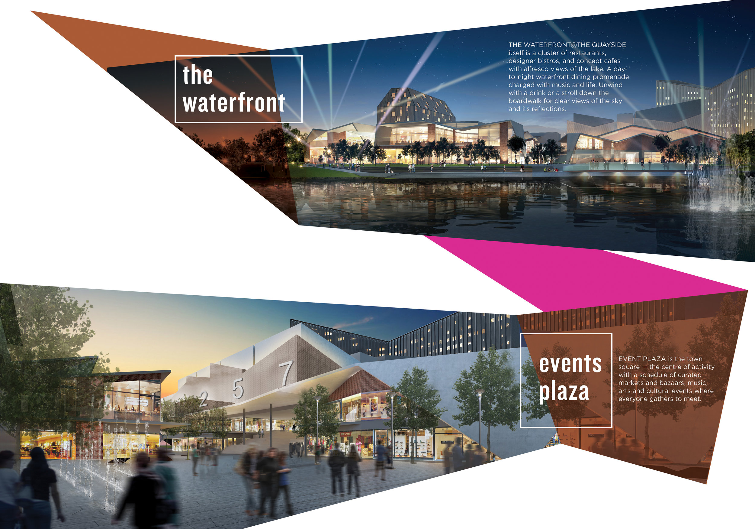
Twentyfive. 7
twentyfive.7 is a stylish development spanning 257 acres and centred on The Quayside, a creative retail hub, and residences with innovative architectural features. We created a distinctive brand image that reflects the personality of twentyfive.7.